All web page designers, however inept, need inspiration from time to time. It’s fairly normal practice to look around at what your peers are doing and transfer, or simply “rip off” elements from other sites for your own. Let he who is without sin cast the first stone…
There are any number of inspirational references for web design, and the best known are Awwwards, Site Inspire or my go-to directory: The Best Designs.
Most of the websites shown in these directories are excellent and can boast high quality design, although they may not be quite so impressive when you want to actually use them. Many of these websites, however, aside from a few honourable exceptions, share structural similarities that bring to mind the uniformity of communist architecture in the ex-Soviet Union.
In this article I want to create a top 5 of the most common elements among the designs that we can find in this type of directory.
Sticky Menu
The sticky menu is the result of landing pages where we are forced to scroll a lot in order to see all the content it has
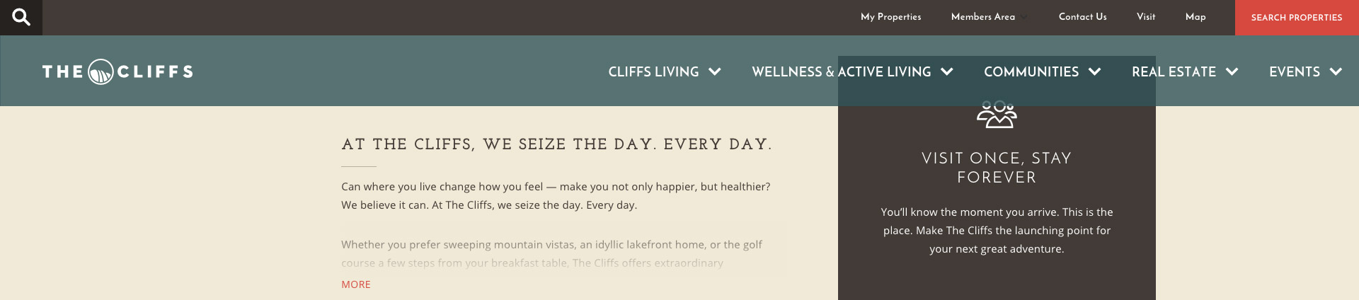
They may be thick or thin, abrupt or smooth, rigid or fluid, etc., but they are still one of the most common beasts in this ecosystem. I am in favour of a sticky menu when it is well-used, retaining the logo and essential navigation elements without distracting from viewing the content.
The sticky menu was forced upon us by the preference for very large homepages and landing pages, and the need for extensive scrolling to see all their content, because without them navigation of these pages would be rather tedious. However, do we really need them for the other pages with less content? We have to decide.
Full Width
It doesn’t make sense to use the typical fixed-width container in the age of responsive design.
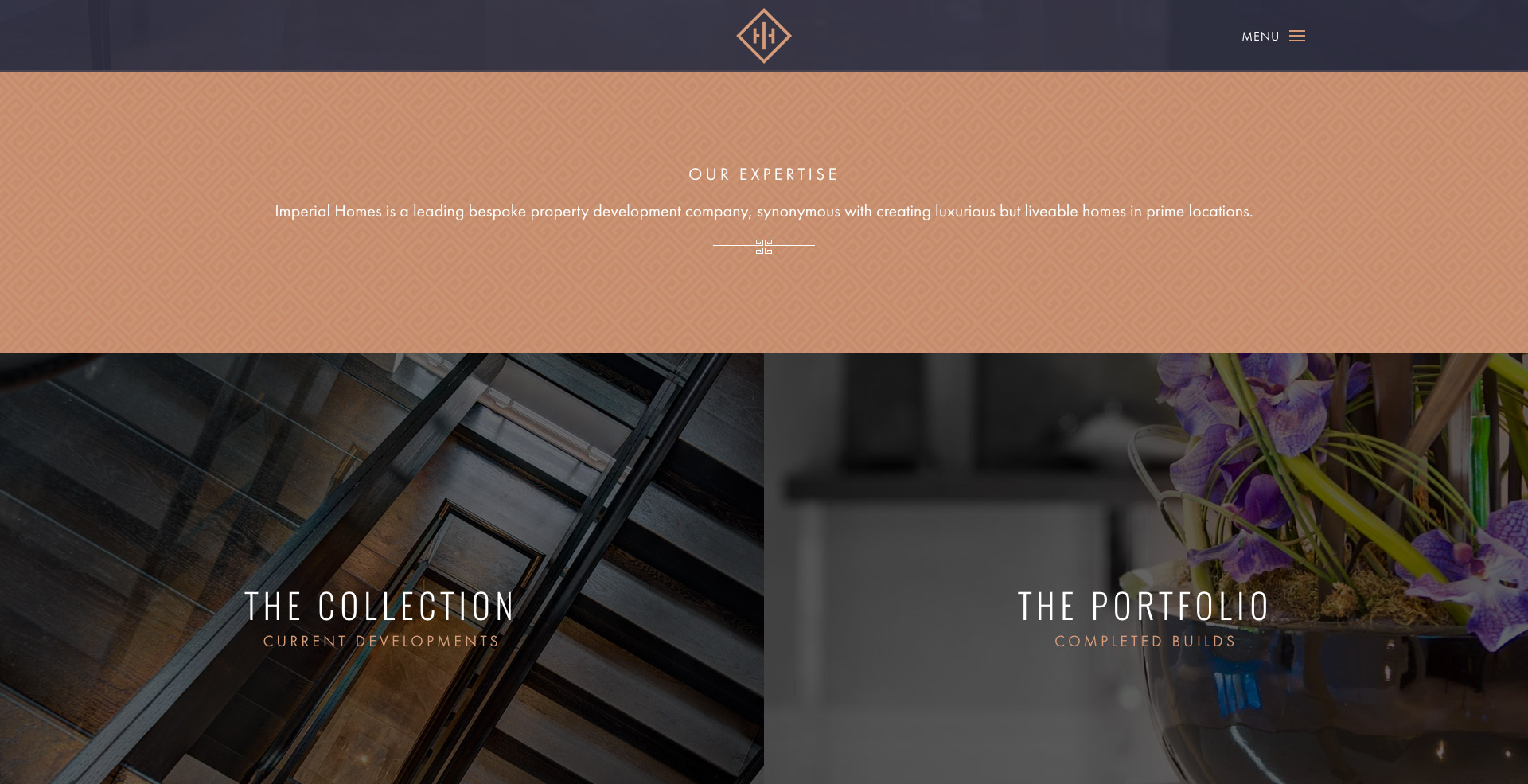
I am very much in favour of pages that use the full width of the browser. In the age of responsive design, where we can adapt our design to the width of the device (or is it the device which adapts to us?) the regular fixed-width container with white space at the sides makes no sense. It is especially useful for visual content, but using it to display plain text would not be a good idea, and would lead to an epidemic of torticollis in the developed world.
Video background
This should be used to enhance the content but not for the content itself.
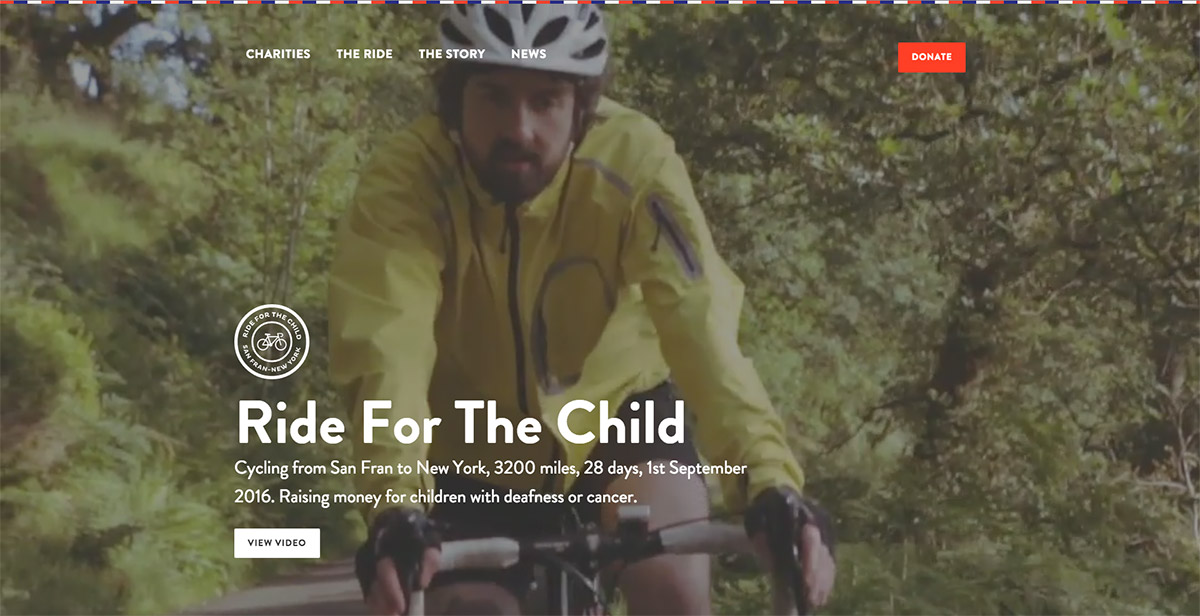
Is it good? Yes. Is it useful? Depends. A video background is what it says it is, a video to run in the background, usually above the fold, to embellish the content but not to be the content. It is best not to abuse this resource by using long videos that user will rarely see fully and do nothing more than delay the page from loading. Everything has its place in this world, and the place for videos is YouTube.
Ghost Buttons
When combined with solid buttons, they allow us to rank the CTA and avoid visual saturation when there are many buttons together.
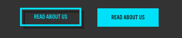
This is this generation’s button, everyone’s favourite, the boy wonder. We are talking about those transparent buttons with only an outline that fill with solid colour when we pass over them. They are very useful when combined with solid buttons, they allow us to rank the CTA by importance and avoid visual saturation when there are many buttons together. Sometimes I wonder if they are the ghost of the old gradient button in relief. What do you think Iker?
Flat colours
This is an attractive technique used by designers to achieve pages which are correct, light, straightforward and responsive.
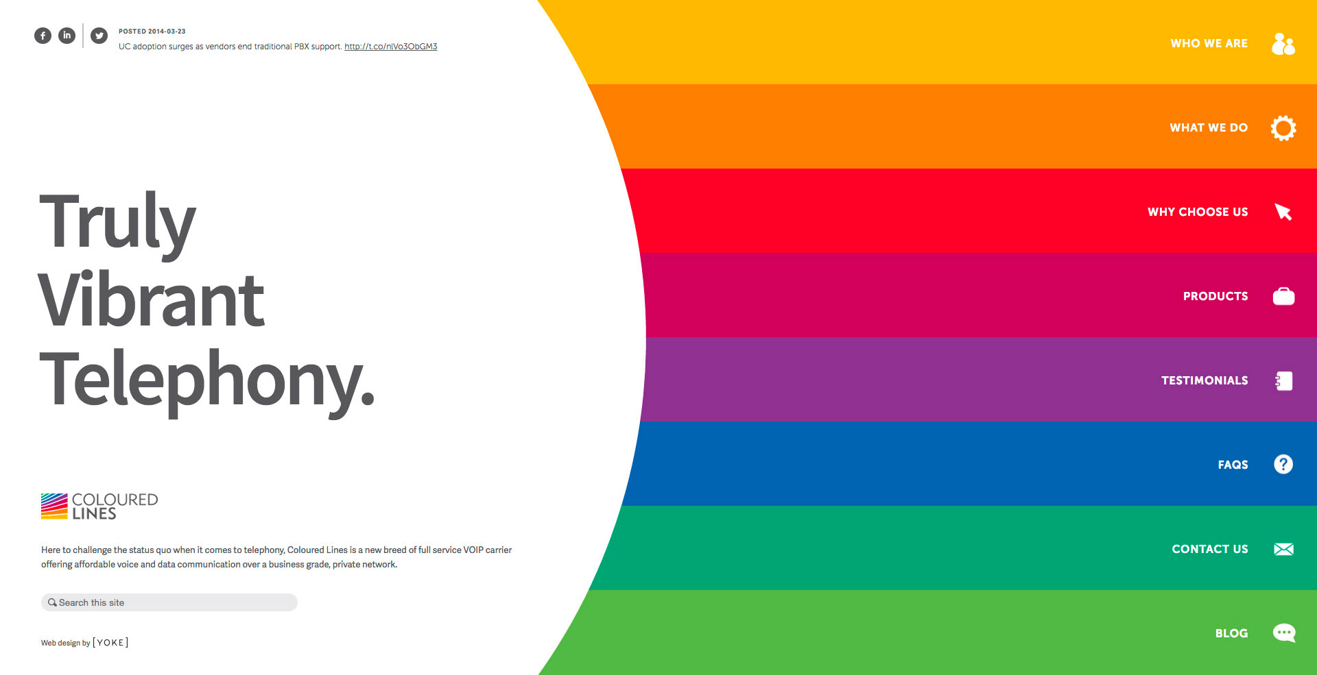
Template based on flat colours at www.colouredlines.com.au
We have left those backgrounds with textures of paper, cardboard and sand behind us. Flat colours are the setting for today’s world. It’s trend that comes directly from the Flat Design pack, and offers an attractive way to easily create pages that display correctly and are light and responsive, without pulling our hair out (those who have any hair left, at least). While it’s true that there are some repeating patterns in some backgrounds, they are always discrete and best taken in moderation, like alcohol or exercise.
That is my top 5. Try them yourself at home: put these 5 elements into a cocktail shaker with some stock images, give it a gentle shake and pour it into your favourite browser. The result is a modern-looking web directory, a college where the most outstanding pupils look just like the rest in their uniforms.